Energy flow diagrams are useful for visualizing where energy comes from and where it goes. In this post, I will collect a number of diagrams for reference purposes (click on the image or the source for a clearer picture):
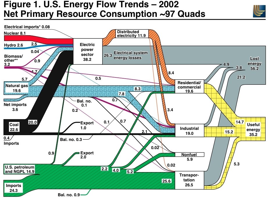
 Source: US Energy Flow Trends(pdf), P. 2, 3U.S. Energy Flow, 2004
 Source: DOE, Annual Energy Review 2004U.S. Petroleum Flow, 2004
 Source: DOE, Annual Energy Review 2004U.S. Natural Gas Flow, 2004
 Source: DOE, Annual Energy Review 2004U.S. Coal Flow, 2004
 Source: DOE, Annual Energy Review 2004U.S. Electricity Flow, 2004
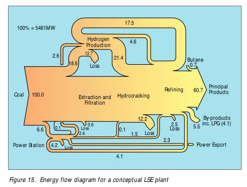
 Source: DOE, Annual Energy Review 2004Energy Flow Diagram, Coal Liquefaction, Liquid Solvent Extraction (LSE) Process
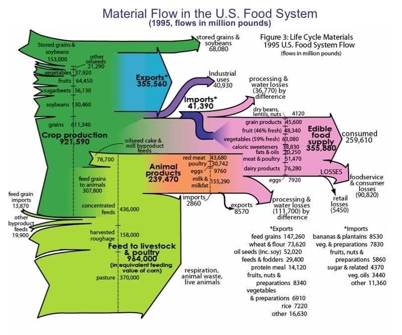
 Source: Technology Status Report: Coal Liquefaction(pdf), Department of Trade and Industry (UK)Material Flow in the U.S. Food System
 SourceMore flow diagrams

1 Comments:
Energy flow diagrams are useful for visualizing where energy comes from and where it goes. In this post, I will collect a number of diagrams for reference purposes
They're for future reference Dukat!
Shoot JD down? If you're such an enthusiastic doomer, run your own analysis on these objective statistics instead of waiting for an opportunity to use your doomer talking points...
Post a Comment
<< Home